Jason from Shy Snake here with some screenshots from our UI update. We’ve been working through our UI, going screen by screen, to make it easier on the eye. While doing this, we have kept our focus on presenting information clearly to the player.
First up the attribute screen. This posed a bit of a challenge for us because we have a larger than normal list of attributes. We chose to have many attributes, to give each character a unique feel. For example rather than simply making a “strong” character you can be quick, powerful, or have great stamina.
Each primary attribute has three sub-attributes within it, to give the character extra detail. For the players that don’t want to see this level of information you can simply look at the major groups that give you an overview.
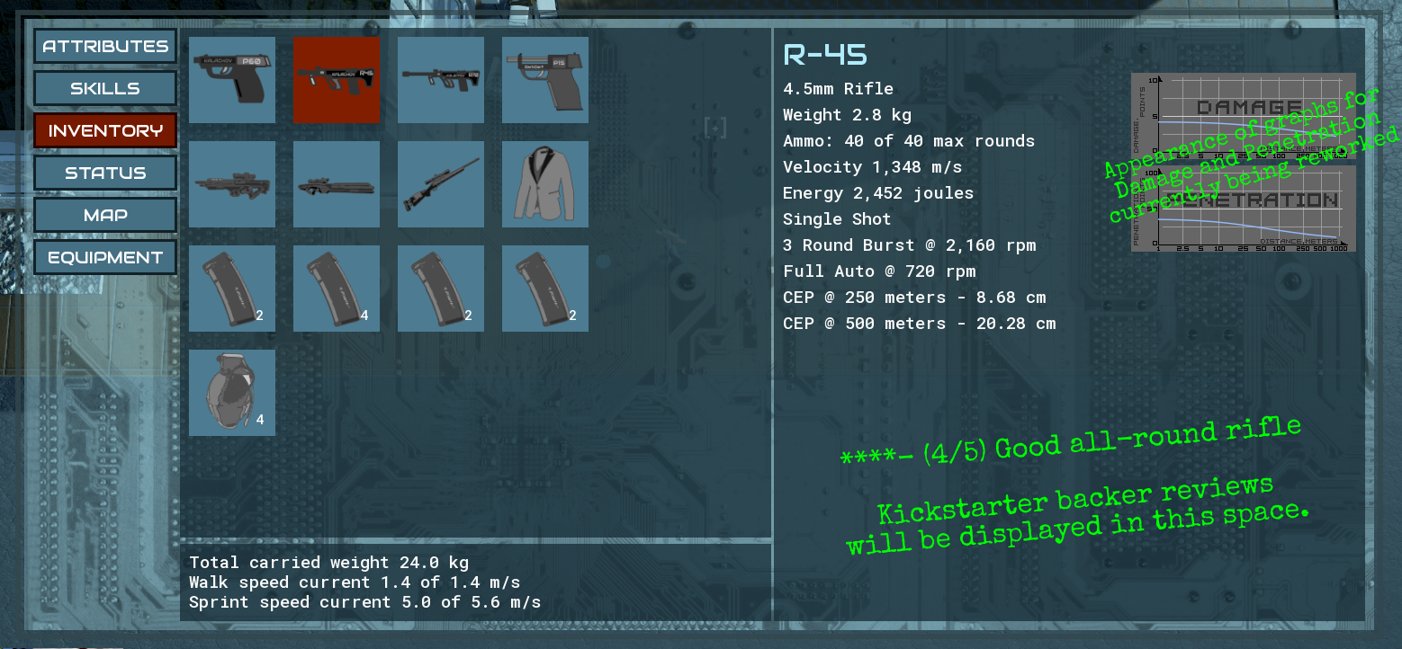
Next up the inventory screen. Here we went with a pretty standard list of icons with numbers to designate stacks of items. Selecting any item will fill the right side with a description of the item.
In this screenshot you can see some details on one of the games weapons. I’m taking this as an opportunity to show the attention to detail we put into the weapons in this game. While the values are not final you can get an idea of what we are building.
At the bottom of the inventory screen you can see how we track encumbrance. In this case the character is lightly loaded so the effect is minimal. No significant effect on walking speed but a minor one to sprinting. We talked at length about the mechanics in an earlier post but here you can see it in action.
We've worked hard to make these changes, and the work isn't quite done yet. Tell us in the comments what you think of these updates!


